
- 19th Nov 2024
- 06:03 am
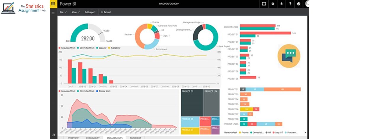
In today's data-driven world, the ability to analyze and present data effectively is essential for making informed decisions. One of the most powerful tools for this purpose is Power BI, a business analytics service from Microsoft. However, simply generating reports in Power BI isn’t enough; to truly unlock the potential of your data, you need to tell a compelling story. This is where data storytelling comes into play.
What is Data Storytelling?
Data storytelling is the art of combining data with narrative elements to help people understand and engage with the insights. It’s not just about presenting numbers, but about making those numbers meaningful and actionable. In the context of Power BI, data storytelling transforms raw data into a visual narrative that resonates with your audience, driving informed decision-making.
Why is Data Storytelling Important?
The human brain is naturally more responsive to stories than to raw data or statistics. Although charts and tables offer valuable insights, they can be overwhelming without a clear structure or context to help make sense of the information. By weaving data into a story, you help your audience better understand complex concepts, identify patterns, and retain key takeaways more easily.
Tips for Creating Impactful Power BI Reports Through Data Storytelling
1. Know Your Audience
Adjust the complexity of your report based on the audience's expertise. For executives, focus on high-level trends and actionable insights, while for analysts, provide a more detailed exploration of the data.
2. Define the Message
Before diving into Power BI, identify the key message you want to communicate. What is the main insight you want your audience to take away? Having this clarity will help shape the design and structure of your report.
3. Use Visuals Wisely
Power BI offers a wide variety of visualization options, but not all charts are created equal. Choose visuals that support your story—use bar charts for comparisons, line charts for trends, and pie charts for proportions. Keep it simple to avoid overwhelming your audience.
4. Focus on Simplicity
Too much data can overwhelm the viewer. Focus on highlighting the key metrics that are most relevant to your story. Use filters and slicers to let users explore the data further without cluttering the report with unnecessary details.
5. Create a Narrative Flow
Similar to a good story, your Power BI report should follow a logical flow. Begin with an overview, present the key insights, and conclude with recommendations or next steps. Use bookmarks, drill-throughs, and buttons to create a smooth, guided experience for the user.
6. Tell a Story with Data Context
Provide context for your data by including comparisons, benchmarks, and historical trends. This allows users to assess whether the numbers are favorable or concerning and helps them understand why the data is important.
7. Incorporate Interactivity
Power BI enables users to interact with reports, making it easier to explore data from various perspectives. Enhance interactivity by adding slicers, filters, and tooltips, which provide deeper insights without overwhelming the user.
Conclusion
Data storytelling is not just a trend; it’s a powerful way to make your data more impactful. By focusing on your audience, defining clear messages, using effective visuals, and structuring your report like a narrative, you can create Power BI reports that not only inform but also inspire action. Mastering the art of data storytelling will not only elevate your Power BI reports but will also ensure that your insights are remembered and acted upon.


