
- 5th Mar 2024
- 06:03 am
Data analytical skill is invaluable in the ever-changing field of data analytics, where the art of transforming rather complicated data sets into something simple to understand is extremely important. At the heart of this transforming process, we have the art of data visualization in which charts and graphs get beyond mere representation and become highly effective. Seeking assistance with Visualizing Data Effectively Using Charts And Graphs assignments? Our SPSS Assignment Help expert team is here to provide tailored Data Visualizing homework help for a clearer understanding. This blog aims to delve into the diverse world of data visualization, examining its significance, different techniques, and the significant influence it wields on efficient communication and decision-making. Struggling with Visualizing Data assignments? Get specialized homework help to master the art of using charts and graphs effectively in data visualization.
The Significance of Visualizing Data
- Clarity Amidst Complexity - In today's tech-filled world, we're drowning in a sea of complex data. To make sense of it all, we need inventive ways to share important info. That is where data visualization comes in- it is like a beacon to this data forest. Analysis charts and graphs can make even complex information appear to us in an undecipherable manner. Whether a person is a professional or a novice, the visual components such as charts and graphs can simplify incomprehensible data to a manageable level. It is sort of getting to know a secret language making information much more open and easily understood.
- Cognitive Advantage - Our brains are naturally programmed to interpret images a lot faster than raw data. Visualizing information is a kind of shortcut that leads to instant comprehension and a more effective memory, which is based on our cognitive style and preferences. This advantage becomes super important in fields where quick decision-making is the name of the game – think business analytics, finance, and healthcare.
- Identifying Patterns and Anomalies - The good thing about data visualizations is that it reveals unknown patterns and irregularities within the discipline of datasets. The visual provides us with an intuitive basis to notice trends, outliers, and anomalies, prepare the ground to dig deeper into the data and make intelligent decisions on this information.
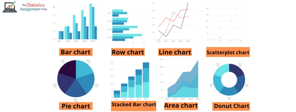
Types of Data Visualizations
- Bar Charts and Line Graphs - In the expansive world of data visualization, two Stalwarts take the center stage: bar charts and line graphs. These visual tools are the go-to options for transforming raw data into insightful narratives. Bar charts shine when it comes to comparing discreet categories or illustrating changes over time. It can be imagined as a graphical representation of the bar chart portraying the change in the monthly sales statistics or the population increase over a couple of years. It can be described as a visual narrator, which adds soul to the data and makes difficult information easy to comprehend and relate to. Line graphs on the other hand are able to tell a story of varying trends over continuous variables, visualizing the view in an almost seamless fashion as the data flows through the contours of the line graph. Whether it is to uncover the progression of stock prices, tracking temperature changes or understand demographic shifts, line graphs without any problems to guide us through the nuanced stories encoded in the data. Together, bar charts and line graphs are as indispensable tools, and translates numbers into meaningful stories that resonate across different target groups.
- Pie Charts and Scatter Plots - The clean and effective pie chart is extensively preferred for the display of proportions in a whole. Its simplicity clearly conveys relative proportions, and hence it is a consistent choice for displaying market share or category proportions. Scatter plots, however, take center stage while exploring associations between two continuous variables. Scatter plots expose associations, clusters, and outliers, and present very useful insights into the intrinsic characteristics of the data.
- Heatmaps and Tree Maps - Heatmaps are like magic maps that use colors to show a big picture of complicated data. They're super handy for revealing connections or changes, giving us a fast grasp of patterns in the information. Now, think of tree maps as a visual blueprint that arranges data in a hierarchy, showing relationships in nested rectangles. They're like architectural plans for data, especially great for understanding how parts fit into a whole in a dataset. These visual tools are like secret codes that help us unravel the mysteries hidden within complex information.
The Practical Applications of Data Visualization
- Business Intelligence - In the business community, data visualization is the cornerstone of Business Intelligence. It is the secret sauce that helps present important insights to everyone involved, and make sure everyone is on the same page for smart decision -making. Imagine dashboards as powerful control centers, loaded with interactive charts and graphs. These dashboards give top executives a live view of important performance indicators, so that they can safely control through the complexities of the business landscape. It's like having a high -tech compass, and guiding business leaders for success with real -time information at your fingertips.
- Scientific Research - In the scientific community, data visualization is such a superhero instrument for scientists. Whether they're analyzing experiment outcomes, presenting trends in nature data, or describing confusing scientific concepts, graphics become a language everyone can understand, irrespective of discipline. Imagine this: from learning about disease to venturing into the secrets of space in fields such as epidemiology and astrophysics, scientists apply the magic of visualization to communicate their findings in a manner that everyone can understand and enjoy. It's akin to making complex science a visual narrative that engages brains in various scientific fields.
Technological Advances in Data Visualization
- Interactive Dashboards and Augmented Reality - In our fast -paced technological times, the development of data visualization tools keeps up with progress. Interactive dashboards, powered by advanced software, deliver dynamic screens, giving users the opportunity to dive into real -time data exploration. These dashboards go a step further, giving users the power to tailor their visualizations, highlighting insights that match precisely with their unique needs. Furthermore, groundbreaking technologies such as Augmented Reality (AR) expand the horizons for data visualization, offering immersive and interactive experiences. This allows users to get involved with complex datasets in ways that were once limited to the Science Fiction Empire. The future of data visualization is not only dynamic, but also promises to be an engaging journey into the kingdom of innovation and user -centric exploration.
- Machine Learning Integration - When we merge machine learning with data visualization, it is like unlocking a whole new world of opportunities to predict the future. Imagine that smart algorithms automatically find out insight and then forged them into our visualizations. It's like getting a super -charged view of trends and possible future scenarios. This combination of Machine Smarts and Visual Magic gives us a complete picture, making our understanding of data even better and helping us see what can come our way.
The Future of Data Visualization
Imagine we're on the brink of some super cool tech changes, and the future of showing data is going to be awesome. So, picture this: with fancy stuff like smart computers, cool virtual reality, and really clever number-crunching, looking at data won't be boring anymore. It's not just about seeing graphs; it's like jumping into a fun and interactive world of information. And here's the best part – everyone gets to join in! As tools to view data become easier for everyone to use, from the computer's whispering to ordinary people, we move towards a future where understanding important things are not just for experts. It's like making data a language everyone can understand, which makes our society smarter and more associated with the world around us. Get ready for a technically filled adventure!
Conclusion
Data visualization helps in making sense of complicated-looking data by depicting it in a more practical manner allowing effective decisions to be made based on the charts, graphs, etc. Whatever you are using, be it in bar charts, heatmap or machine learning visualizations, developing the skill to work with the techniques makes it imperative towards being a success in data analytics. Whether you need our help with the assignments or expert advice, what we offer is a specialized service. Visit our SPSS Assignment Help, STATA Assignment Help, Data Analytics Assignment Help, Machine Learning Assignment Help and Econometrics Assignment Help now to enjoy expert help and achieve brilliant results in the academic path ahead.
About The Author:
Name: Prof. Alex C.
Qualification: Prof. Alex C. is a leading expert on data visualization with a degree in information visualization and interaction between Human-Computer Interaction.
Bachelor's Degree: Prof. C. started its academic journey with a comprehensive bachelor's degree.
Master's Degree: He pursued a master's degree focusing on information visualization.
Research Focus: Prof. Alex C. specializes in effectively visualizing data using charts and graphs, mixing principles for visual perception and design aesthetics.
Expertise: With long experience, he stands out by selecting and implementing appropriate charts and graphs for clear and effective computer representation. Professor C. contributes with insight into both academia and practical applications, making him a resource for improved data visualization skills.


